Data presentation is love. But not today.
Consistently, a few charts that are critically important now.

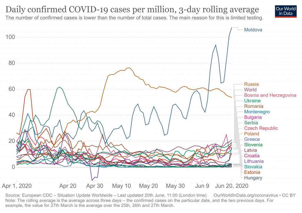
1. Daily growth of sick people per million people (average for every 3 days) from April 1 to June 20 for all countries of the generally understood Eastern Europe (European republics of the former USSR + former “people’s democracy” bloc + republics of the former Yugoslavia)

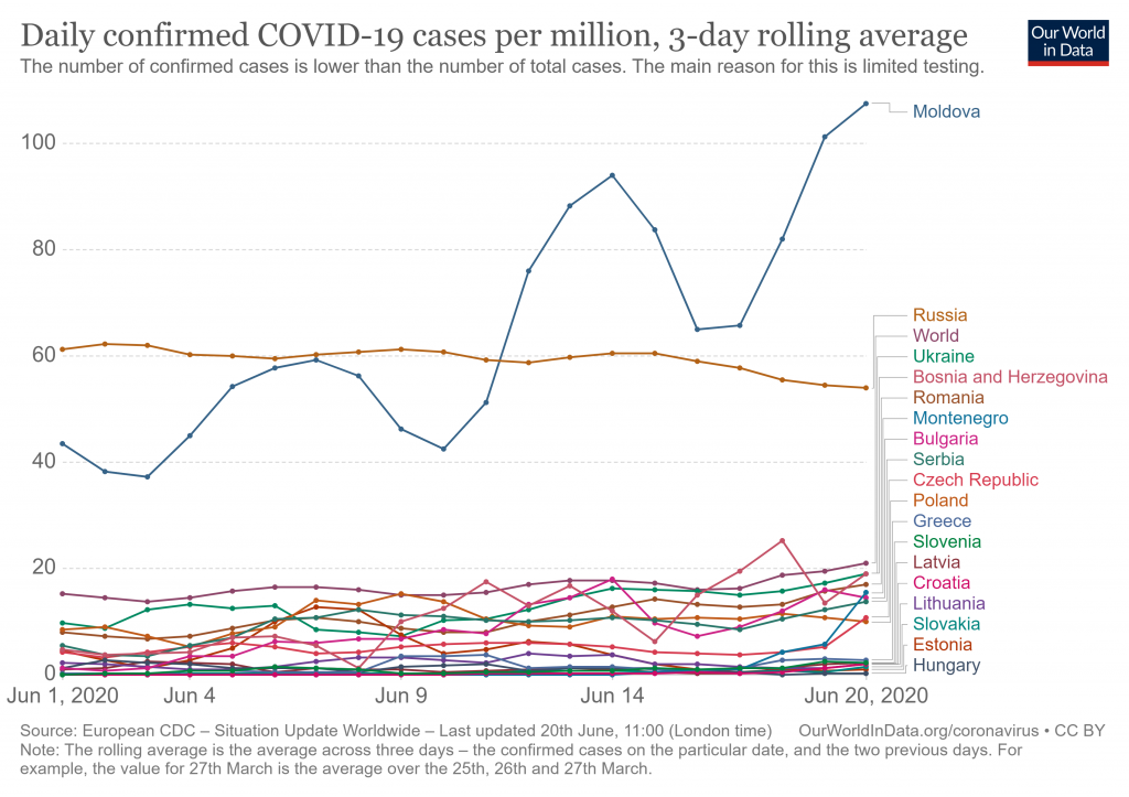
2. Daily gain per million people (average for every 3 days) from 1 to 20 June for all countries mentioned above.

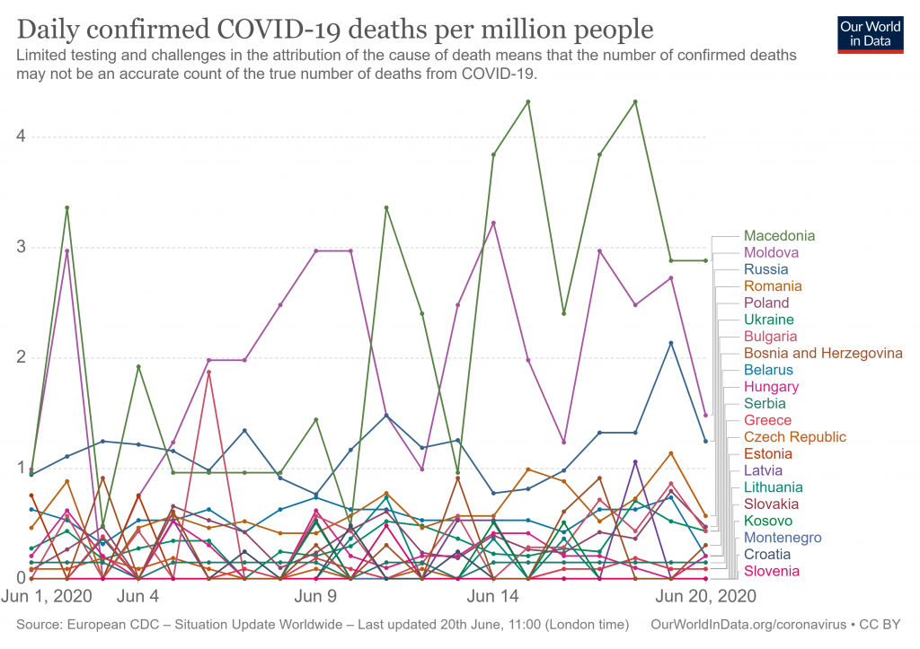
3. The daily increase in the number of deaths per million people (daily) from 1 to 20 June for all the countries mentioned above.
In the first graph, Moldova is in the first place, in the second graph Moldova is the absolute champion who cuts everything in the area from Szczecin to Vladivostok and from Tallinn to Athens, and in the third graph, Moldova is the second, first is Macedonia.
I won’t have any comments, I have everything which needs to be mentioned in these charts.
